
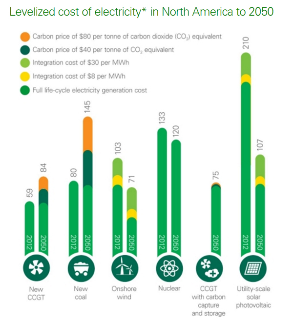
 This diagram, based on American data tells a very important story. The deep green bars are the full life cycle cost of electricity generation. It shows that gas (first column) and coal costs will remain constant but that wind and solar will both show a dramatic reduction in cost of production over the next 35 years. All sources are cheaper than nuclear with the exception of the current solar costs, which will drop substantially by 2050 and the future costs of coal if the carbon costs are included. The graph was produced by BP’s agency, Technology Outlook and along with a more in depth article can be found here. It would be helpful to have this sort of data for the UK readily available, particularly if it was available from an Independent source and accepted by a range of agencies. Arguments are much easier to understand when the data is clear and reliable. On this basis we would pour R&D investment into solar rather than investing so much in nuclear, and we would make a case for onshore wind to be treated more seriously. It would clearly be helpful to see offshore wind too. So where is our diagram?
If you find any of these posts relevant to some of the social or political issues of the moment do leave a comment or contact me directly (click on my photo for my contact details)
Blog Stats
- 109,035 hits
-
Join 86 other subscribers
-
Recent Posts
Archives
Top Rated
Categories
- Afghanistan (27)
- Brighton & Hove (856)
- Casey Review (5)
- Charities (526)
- Church Teaching (232)
- Community Safety (289)
- Data Retention and Investigatory Powers (17)
- Deaf & Hard of Hearing (62)
- Economics (556)
- Education (487)
- Environment (222)
- EU Referendum (554)
- Health Reform (137)
- Housing (87)
- Immigration (126)
- Journalism (130)
- Justice Issues (221)
- Lobbying Bill (65)
- Network Rail (64)
- Obituary (22)
- Parliament and Democracy (3,659)
- Phone Hacking (7)
- Planning Rules (57)
- Police & Crime Commissioner (207)
- Policing (412)
- Scottish Referendum (23)
- STEM (68)
- Syria (90)
- Think Tanks (15)
- UK Riots in August 2011 (15)
- Ukraine (17)
- Uncategorized (61)
- Welfare Reform (72)
- Yemen (44)
- Youth Issues (499)
Twitter Updates
Tweets by IanChisnall- Amber Rudd
- Andrew Griffith
- Boris Johnson
- Brexit
- Brighton & Hove
- Brighton & Hove City Council
- C-19
- Caroline Ansell
- Caroline Lucas
- Charities
- Charity Commission
- Charity Commission for England and Wales
- Chris Grayling
- Conservative Party
- Coronavirus
- COVID-19
- Daniel Hannan
- David Cameron
- David Davis
- Department for Education
- Donald Trump
- e-petition
- Eric Pickles
- EU Referendum
- European Union
- FareShare
- Foodbanks
- George Osborne
- Gillian Keegan
- Government
- Green Party
- Henry Smith
- Home Office
- House of Commons
- House of Lords
- Huw Merriman
- Iain Duncan Smith
- Independent Candidates
- Jacob Rees-Mogg
- Jeremy Corbyn
- Jeremy Hunt
- Jeremy Quin
- Katy Bourne
- Keir Starmer
- Labour Party
- Lib Dem Party
- Liz Truss
- Lloyd Russell-Moyle
- Lobbying Bill
- Maria Caulfield
- Matthew Hancock
- Member of Parliament
- Michael Gove
- MPs
- NHS
- Nick Gibb
- Nigel Farage
- Nusrat Ghani
- Parliament
- Peter Bottomley
- Peter Kyle
- Police and Crime Commissioner
- Priti Patel
- Rishi Sunak
- Sajid Javid MP
- Sally-Ann Hart
- Small Businesses
- SME
- Steve Bassam
- Sussex
- Sussex Police
- Syria
- Theresa May
- Tim Loughton
- UKIP

